共 1 条评论关于"利用Animation与Svg绘制loading/圆形进度条组件"


最新评论
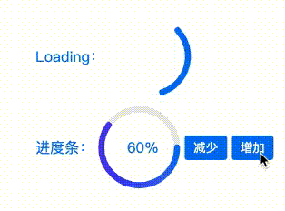
很多UI框架都有那种原型进度条,其实我们自己通过Animation自己也能很容易画一个,本篇文章案例来自(凹凸实验室),例如下图:
首先,我们使用 svg 绘制一个圆周长为2 * 25 * PI = 157 的圆
1 2 3 4 5 6 7 8 9 | <svg with='200' height='200' viewBox="0 0 100 100" > <circle cx="50" cy="50" r="25" fill="transparent" stroke-width="4" stroke="#0079f5"> </circie> </svg> |

1 2 3 4 5 6 7 8 9 10 11 | @keyframes loading { 0%{ stroke-dashoffset: 0; } 100%{ stroke-dashoffset: -157; /* 线条顺时针偏移 */ } } circle{ animation: loading 1s 0s ease-out infinite; } |
1 2 3 4 5 6 7 8 9 10 11 | @keyframes loading { 0%{ stroke-dashoffset: 0; } 100%{ stroke-dashoffset: -207; /* 保证动画结束时仍处理动画开始位置 */ } } circle{ animation: loading 1s 0s ease-out infinite; } |
1 2 3 4 5 6 7 8 9 10 11 12 13 14 15 16 17 18 19 20 21 22 23 24 25 26 27 28 29 30 31 32 33 34 35 36 37 38 39 40 41 42 43 44 45 46 47 48 49 50 51 52 53 54 55 56 57 58 59 60 61 62 63 64 65 66 67 68 69 70 71 72 73 74 75 76 77 78 79 80 81 82 83 84 85 86 87 88 89 90 91 92 93 94 95 96 97 98 99 100 101 102 103 104 105 106 107 108 109 110 111 112 113 114 115 116 117 118 119 120 121 122 123 124 125 126 127 128 129 130 131 132 133 134 135 136 137 138 | <!DOCTYPE html> <html lang="en"> <head> <meta charset="UTF-8"> <meta name="viewport" content="width=device-width, initial-scale=1.0"> <title>Animation 与 Svg 绘制 loading/进度条 组件</title> <style> div { position: absolute; left: 50%; top: 50%; transform: translate(-50%, -50%); color: #0079f5; } div label { display: flex; align-items: center; } @keyframes loading-active { 0% { stroke-dashoffset: 0; } 100% { stroke-dashoffset: -207; } } .loading svg { transform: rotate(-150deg); } .loading circle { animation: loading-active 1s 0s ease-out infinite; } .progress circle { stroke-dasharray: 157 157; stroke-dashoffset: 0; stroke-linecap: round; transition: stroke-dashoffset 0.8s cubic-bezier(0.29, 0.6, 0.42, 0.99); } .progress .trail { stroke-dashoffset: 0; } .progress span { position: absolute; left: 50%; top: 50%; transform: translate(-50%, -50%); left: 118px; top: 150px; } .progress button { margin-right: 5px; border: 0; color: #fff; padding: 4px 10px; background: #0079f5; border-radius: 0.25em; outline: none; cursor: pointer; } .progress button:nth-of-type(1){ background-color: #bbb; } .progress button:active { opacity: 0.8; } </style> </head> <body> <div> <label class="loading"> Loading: <svg with='100' height='100' viewBox="0 0 60 60"> <circle cx="30" cy="30" r="25" fill="transparent" stroke-width="4" stroke="#0079f5" stroke-dasharray="50 157" stroke-linecap="round"></circle> </svg> </label> <label class="progress"> 进度条: <svg with='100' height='100' viewBox="0 0 60 60"> <defs> <linearGradient id="gradient" x1="100%" y1="0%" x2="0%" y2="0%"> <stop offset="0%" stop-color="#0079f5"></stop> <stop offset="100%" stop-color="#6149f6"></stop> </linearGradient> </defs> <circle class="trail" cx="30" cy="30" r="25" fill="transparent" stroke-width="4" stroke="#eee"></circle> <circle id="progress-bar" class="path" cx="30" cy="30" r="25" fill="transparent" stroke-width="4" stroke="url(#gradient)" style="stroke-dashoffset:141.3"></circle> </svg> <span id="progress-detail">20%</span> <button onclick="reduce()">减少</button> <button onclick="add()">增加</button> </label> </div> </body> <script> const bar = document.getElementById('progress-bar') const detail = document.getElementById('progress-detail') const total = 157 // 圆周长 const per = total / 100 //一个百分比进度代表的周长 let progress = 20 // 当前百分比进度 function add() { if (progress >= 100) { return } progress += 20 update() } function reduce() { if (progress <= 0) { return } progress -= 20 update() } function update() { bar.style.strokeDashoffset = (total - per * progress) detail.innerHTML = `${progress}%` } </script> </html> |
1 2 3 4 5 6 7 8 9 10 11 12 13 14 15 16 17 18 19 20 21 22 23 24 | <!DOCTYPE html> <html> <head> <meta charset="utf-8"> <title>长方形进度条</title> <style> #grad1 { height: 200px; min-width: 60px; color: #333; height: 28px; line-height: 28px; background:linear-gradient(90deg, #55cbff 44%, #f1f1f1 0%) } </style> </head> <body> <h3>线性渐变 - 头部到底部</h3> <p>从头部开始的线性渐变,从红色开始,转为黄色,再到蓝色:</p> <div id="grad1"></div> </body> </html> |

上一篇:三年韭菜关于投资底层逻辑(价值投资概念)一些思考总结分享
下一篇:前端黑科技:root之CSS变量var,从此Sass/Less是弟弟(下篇)
最新评论
支付宝扫一扫打赏

微信扫一扫打赏

电话支持
173xxxx7240在线交流
微信添加

顶一下!!!不错哦!!